![]() Happy friday, everyone! As you may know, we’ve been busy in the past few months working on a number of things, mostly focused on the iOS apps including both the iPad and the iPhone app. The P+ for iPhone app is something we’re taking very seriously and we’ve spent quite some time with it. We’ve come up with and thrown away several designs along the way, simply because we didn’t choose the easier route and just migrated the iPad app to the smaller screen. We wanted to create something that’s genuinely designed for the form factor, something that’s visually pleasing and joyful to use. And today, I am very excited to show you what we have in our sleeve.
Happy friday, everyone! As you may know, we’ve been busy in the past few months working on a number of things, mostly focused on the iOS apps including both the iPad and the iPhone app. The P+ for iPhone app is something we’re taking very seriously and we’ve spent quite some time with it. We’ve come up with and thrown away several designs along the way, simply because we didn’t choose the easier route and just migrated the iPad app to the smaller screen. We wanted to create something that’s genuinely designed for the form factor, something that’s visually pleasing and joyful to use. And today, I am very excited to show you what we have in our sleeve.
Update: P+ for iPhone was just tested on the iPhone 5 and it was AMAZING!
Update 2: Two new features of P+ on iPhone and screenshots
Update 3: Pagico Plus for iPhone Beta is now up for grab!
Overview
P+ for iPhone is designed from ground up for the smaller screen. In order to make better use of the precious screen estate, we went with a minimalistic design so that literally no pixel is wasted by unnecessary, decorative elements. However, we didn’t stuff it up like a newspaper either — we used simple lines and shapes, and of course spaces to make it look just right. I’m sure you’ll appreciate the simplicity and the cleanness of the user interfaces. 🙂
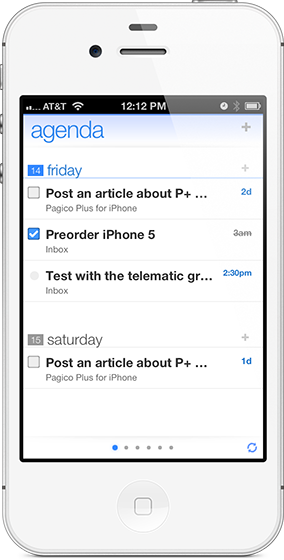
Here are a couple of pictures to give you some overall feeling of the app:
Navigation
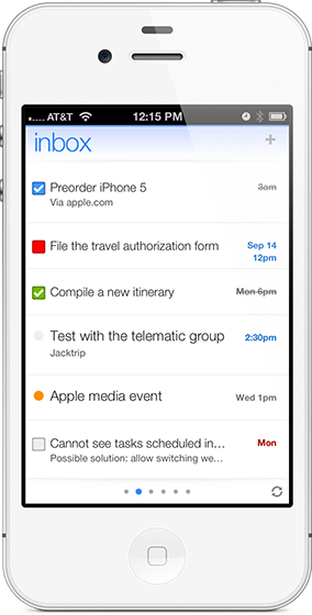
In addition to the clean and minimalistic design, the app has a number of very unique design features. I’d like to begin with the navigation. As you can see from the picture (above), at the bottom of the screen there is a carousel-like indicator that shows the total number of views (read: pages) that are currently available. You will be able to swipe left and right to switch between these available views. You can tell it’s very similar to the iOS home screen. By default the app will present you with three views: the Agenda (shown above), the Inbox, and the Workspaces view that lists all your workspaces.
But the interesting design starts from here: the views are dynamic. Whenever you switch to a project (or a contact), the project will be opened and presented in a new view next to the current one. And the view will stay there as long as possible, until it gets rotated out when the project is not accessed in a long period of time. The benefit of this design is that it provides two functionalities at once: the basic navigation and the management of recently access items. And no matter where you are in the app, you’re just one swipe away from your recently accessed project (or contact).
Here’s another feature that makes this design superb: you can scrub on the view indicators (those little dots) and jump to any view right away — no need to navigate one view at a time. So, navigating among all the different views can be really fast and easy.
As such, this is a design that we loved using during our tests, and I hope you’ll like it as much as we do.
Reminders & File Attachments
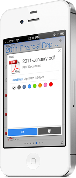
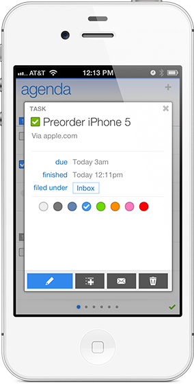
There are many other features that are worth mentioning, such as the ability to set reminders with a wide range of options, and viewing file attachments, etc. But I guess the best way to talk about it is to just show it. 🙂
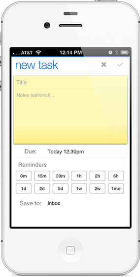
Also, we’ve enhanced the notes feature to make it work as an “Appointment” feature. So you can set up things like meetings or watch that football game, which are things that aren’t really tasks but you want to get reminded about.
Cloud Sync
Cloud sync is integrated seamlessly into the app. As you can see that at the bottom-right corner there’s a little “sync” icon. The app will automatically sync with the cloud servers once in a short while, and you’ll be able to see the sync activity by taking a glimpse of the rotating icon. Also, you can manually trigger the cloud sync by tapping on it. The sync process is done in the background, meaning that whatever you’re doing (writing a task or viewing a file attachment, etc) will not be interrupted at all.
A couple of more shots…
Availability
P+ for iPhone will be available for iPhone 4/4S and iPhone 5 with the gorgeous 4-inch screen. Based on our tests, P+ works fantastically well on iOS 6 and does have a few glitches on iOS 5. So our current plan is to get it ready for iOS 6, which will be available to the public later next week for free.
At this very moment we’re still wrapping up the project with a few minor features to implement. While the app won’t be ready for prime time until later this year (our current ETA is around November), we surely will be hosting a beta program in the next few weeks.
So, please do let me know what your thoughts are and/or if you’re interested in beta testing it with us down the road.
Have a great weekend,
Ryo