It has been over 2 months since Pagico Plus for iPad was released, and now it’s a great time to do a quick review about it and share with you guys about what comes up next (in about 5 days).
Pagico Plus (short for P+) v1.0 was initially released back in December 12th, 2011. It certainly wasn’t the best launch we’ve had: data-corrupting issues were accidentally introduced as we were trying to do some last-minute touch-up works. The result? Hundreds of upset users. Thank god we are not nearly as popular as Angry Birds, so the problem were still in a controllable scale. Otherwise, somewhere in Japan two poor guys could have been killed (hint: that’d be us). Anyways, we did what we had to do — fix the problem and get it out as quickly as possible. Apple’s review team should receive some credits here, as they worked with us and gave us a tremendous help — the review of the update was expedited and it took just one day, instead of costing us at least 5 days waiting in the queue.
Fast forward to January 2012, we made our first “real” update to P+, v1.1. It was an important update as it brings a number of important feature improvements including the support for repeating tasks, timestamps in notes, deleting projects and contacts, etc. Overall it was a pretty solid release with only one minor glitch that was soon addressed by a follow-up release (v1.1.1).
Now that we’ve gotten the app completed, it’s time to think about improving the user experience. In other words, we want to make the app more intuitive and easier to work with. So here comes the v1.2, which focuses on improving the usability and brings in another functionality that has been missing all alone.
One thing we didn’t like, and I’m sure you didn’t like either, was the fact that you’ll have to invite yourself to workspaces that you created. That doesn’t sound right at all. So in this v1.2, P+ will automatically join all workspaces created in your Pagico ID account (the same thing will happen to Pagico for desktop v5.2 r1236 as well). Therefore, you just sign in with your Pagico ID account, and everything else is all set. No more invitations for yourself. This will also save you tons of time if you removed the P+ app and reinstalled it on your iPad.
One other thing that is better in v1.2 is that we improved the loading process in containers (e.g. Inbox, projects, and contacts) with large number of objects. In the new version, things will load faster and you’ll also get an accurate progress bar showing you the loading process.
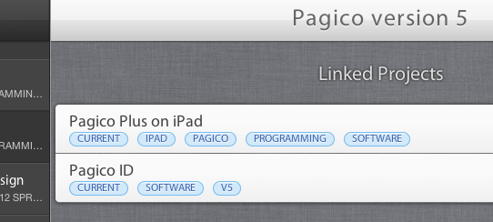
Last but not least, the v1.2 also supports container-level cross links that you created on your desktop computers. Tap on the “More Actions” icon and then the “See linked items” menu command to reveal the connected projects/contacts. You can add new links and remove existing ones by simply swiping over the link item.

Are you interested now? I certainly hope so!! The v1.2 has already been submitted to the App Store and waiting to be reviewed. We’re expecting it to be available to you around Friday this week, March 2nd.
Moving forward, the next upcoming revision will still be primarily focused on the user experience, so that we can eventually make P+ the best choice for your planning needs on-the-go.
Cheers,
Ryo