![]() As you might have heard, that we’ve been busy developing a mobile Pagico app for iPad for quite a while now. And we’re happy to report to you that things are moving quite nicely. Since it’ll still take some time before you can get it, I figured that you might enjoy some in-depth preview of the upcoming mobile Pagico app for iPad, which is called Pagico Plus (or P+). For those of you who have no idea what P+ is, please head over here which also has several huge screenshots.
As you might have heard, that we’ve been busy developing a mobile Pagico app for iPad for quite a while now. And we’re happy to report to you that things are moving quite nicely. Since it’ll still take some time before you can get it, I figured that you might enjoy some in-depth preview of the upcoming mobile Pagico app for iPad, which is called Pagico Plus (or P+). For those of you who have no idea what P+ is, please head over here which also has several huge screenshots.
Getting into P+

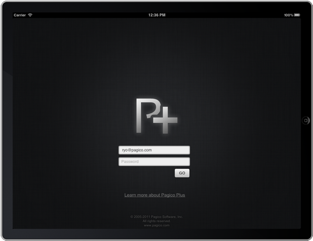
The first thing you’ll do when launching P+ (especially for the first time), is to log in. We’ve been busy preparing our online portal called Pagico Online, and the account that you’ll soon have is called Pagico ID. Once logged in, P+ will determine if you have turned on the inboxSync feature. If so, it will start synchronizing with the Workspace server to get all the latest inbox data.
How does it sync?
A common question for the iPad app would be: how does it sync? Well, the answer is: P+ syncs all your data via the Workspace mechanism. So it doesn’t rely on things like Dropbox or the soon-to-be-discontinued MobileMe, and it doesn’t sync your entire databases. We designed it this way because you’ll rarely need to access your entire database on-the-go. The most common scenario is that you need access to your inbox (to capture notes and errands), and currently active projects (and profiles). Instead, P+ only syncs your inbox data and all your workspaces. If a project/contact profile needs to be access on-the-go, simply share it under a workspace and let P+ join the corresponding workspace. If, on the other hand, you desperately need to sync an entire database so that you can have complete access on iPad, just create a workspace and share everything. It’s a bit of work, but we think this workload is somewhat acceptable since this scenario doesn’t happen quite often (and you’ll only have to share the projects once).
Now, let’s move on to the next screen. 🙂
The Dashboard
The Dashboard screen on desktop Pagico app is one of my favorite screens. It gives me a bird’s eye view of all my projects, as well as a daily planning area where I can easily prioritize tasks. But iPad (and other tablets) is a different platform and we want to make something unique and specific to this device.

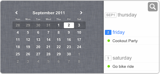
As you can see, the dashboard screen has three different view modes with the first (and default) called Agenda View. In this view, you not only get a contemporary-looking interactive mini-calendar, but also a weekly task list that gives you an overview of what to expect for the week. Tapping on the mini calendar easily changes the weekly task list, and by tapping on a certain day in the task list you can easily add new tasks for that particular day.
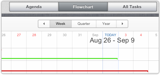
And of course, the signature schedule flowchart isn’t left out in the iPad version.

To be continued…
That’s it for now, and we’ll for sure come back with more details about the app in the very near future. Currently we’re just polishing everything and waiting for the release of iOS 5, which shouldn’t be too far, right? Please stay tuned. 🙂
Cheers,
Ryo