
If you think that our past few months have been focused on Pagico on iOS, you’d be right. But if you think that Pagico on iOS is all we did, you’d be wrong. 😉 Along with the iOS app development (which was very exciting indeed), we were also moving forward with our desktop apps. We’ve put so much time and effort into the desktop apps, that I think you’ll be blown away by the improvements we made. While the app isn’t at the finish line yet, I’d like to give you a little sneak peak about what’s coming up.
As our first sneak peak article, I’d like to briefly go over high-level stuff first. We’ll get to detailed items in our future posts. So, in general, Pagico for Desktop version 6 is going to be better in these ways:
UI Improvements
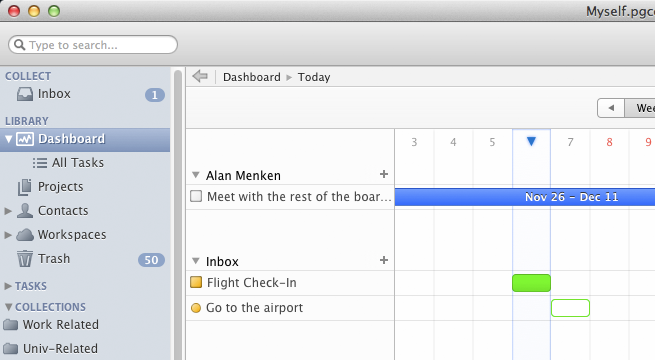
The user interface in Pagico version 6 will look much more polished. We literally left no stone untouched — every single aspect of the user interface has been improved. Most of the icons are replaced with consistent use of color, making the entire UI coherent and modern.
Also, Pagico v6 is Retina-Display ready. If you happen to have one of those Retina-Display laptops, you’ll for sure be able to identify this change — everything is crisp and clean. No more fuzzy icons and graphics.
New features come, and old (unnecessary) ones go.
No, we’re not just plainly adding new features to make Pagico v6 bloated. We did a thorough review of version 5, and identified a number of unnecessary features and user experience weaknesses. Based on the findings, we removed features that aren’t heavily used, and added new ones with the aim of making Pagico easier to use.
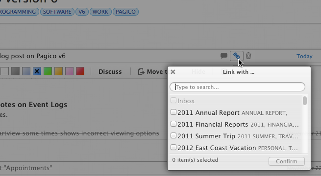
For example, creating cross links is one of Pagico’s signature features. It used to involve the user typing either the title or the very long UID of the target object. But in version 6, all you need to do is to click on the “link” button and choose the target.
Another new feature is “Appointments”. You know you can now set up notes with time, right? Well, starting from v6, notes with times are “appointments”. Meaning that they will also show up (on your Dashboard) at the day of the event, and will automatically go away when the time has passed. It’s perfect for appointments or meetings, where you’d like to be reminded before hand, but no need to check them off afterwards.
One of the features that is getting cut is the “Create New Document with Template” feature. You no longer will be bothered by the confusing grid of document templates in the settings panel, or the four document options in the “Add New” menu. Because, after all, you can store and work with any given document type in Pagico.
Usability Improvements
Lots of details have been added or tweaked to improve the overall user experience (UX).
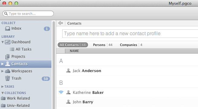
One of the component that received UX improvement, is the contact list view. Instead of showing you everything in a super-long list, Pagico v6 can also show you things in separate, smaller lists, such as “Persons-Only” or “Company-Only”. And if the database has thousands of contacts, Pagico shows the 200 contacts you recently accessed by default.
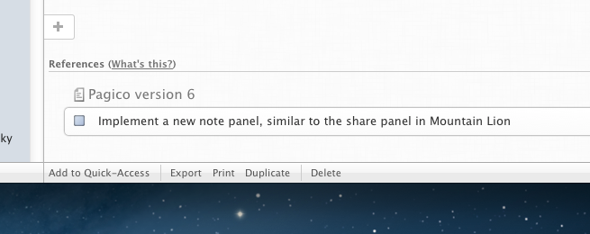
The “References” feature has also been improved. For example, when a task is linked from a project to a contact profile, you’d see a simple display of the task in the footer area of the contact profile. There isn’t much you can do with it, other than looking at it (or switch to the project and mark it as done). In v6, those things will be displayed with much more details in the References section, and you can check things off (or back on) right there. A simple improvement, but you’ll love it when you have lots of tasks cross linked with contacts (or other projects).
Better Workspaces
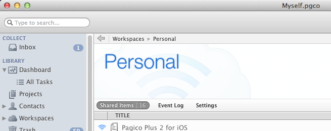
The Workspaces feature is receiving a lot of attention as well. We worked very hard to make your data-sync easier, and optimized the feature for both personal sharing (syncing data across your own computers and devices) and small-team sharing (collaborating with others).
Sharing new projects/contacts in a workspace in much easier, and Pagico will also show the sharing status and participants in a much more obvious way — you’ll never need to wonder whom you’re sharing data with. Creating new workspaces can now be done in the application directly, and inviting other peers to join your workspace is also effortless.
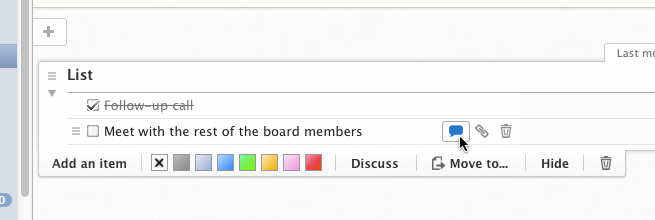
Perhaps one of the biggest improvement in this area, is the introduction of the “Discuss” feature. You and your team can comment on any object (Lists, list items, notes, files, etc), and comments will be displayed right next to the object. Everyone in the same workspace can see and join the discussion with a simple click.
Of course, it’d mean nothing if you didn’t know where to look. So Pagico v6 also shows you an “Event Log” to let you quickly catch up to who’s doing what in the workspace in the last few days. Therefore, you’ll never miss a discussion, or an important change in shared projects.
Better Performance
Even with all the additions, Pagico v6 is going to be not slower, but FASTER than its predecessor. We spent a huge amount of time to optimize the under-the-hood actions of Pagico to make it work very fast, even when dealing with large amount of data. We have been constantly testing against databases with 3000 projects and 3000 contact profiles, and so far the results have been satisfactory.
Opening projects and contacts is much faster, writing new list items or saving existing ones will have minimal delay, and the search functionality has been completely re-written to offer you super-fast search results as-you-type.
To wrap up…
Pagico v6 is getting close to the finish line. Our current ETA is around the second half of January, 2013. And it will be available for Mac, Windows and Ubuntu. And we may host a private beta event prior to that, just to be sure.
As always, we want our current customers to be worry-free as well! For those of you who purchased Pagico Professional Edition licenses on or after December 6th, 2012, you’ll enjoy a FREE upgrade to version 6 when it comes out. For everyone else, there will be a small upgrade fee go from v5. More details on release date and upgrade cost will be announced when we get closer to the New Year.
This article is just scratching the surface of what we have for you in this coming version 6. It’s going to be exciting! And we’ll post a few more articles to show you more details in the very near future. So please, stay tuned!
Cheers,
Ryo
P.S.: Just so you know, the screenshots above were made on a 5-year-old Macbook Pro, which is why you’re still seeing the scroll bars and non-retina graphics. Pagico v6 will look much better on a modern machine.