![]() This is our current icon, which was designed back in 2007. It looked great back then, and still looks quite nice today. However, years have passed and we’re in a brand new digital age. With the introduction of Pagico Plus late last year, the fact that the current icon is old is getting more and more obvious. It simply wasn’t designed using the modern design language that people are used to nowadays. Therefore, we set out and designed a new icon. And here it is:
This is our current icon, which was designed back in 2007. It looked great back then, and still looks quite nice today. However, years have passed and we’re in a brand new digital age. With the introduction of Pagico Plus late last year, the fact that the current icon is old is getting more and more obvious. It simply wasn’t designed using the modern design language that people are used to nowadays. Therefore, we set out and designed a new icon. And here it is:
![]()
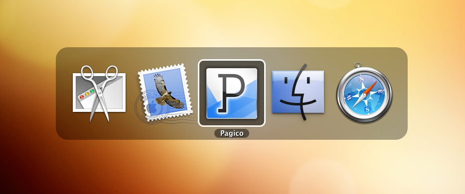
To put it into context, here are a few more screenshots with the icon in action:

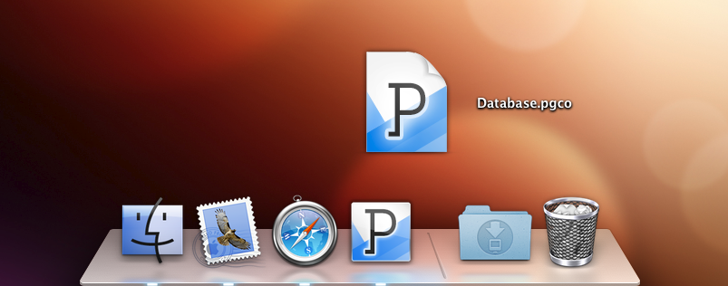
And here is how the new icon looks in the dock, along with the brand-new document icon (screenshot taken on Mac OS X 10.8):

After a few days of testing, we’re very happy with the new icons we hope you’ll like it as much as we do. We’re planning to roll them out in a new revision of Pagico for Desktop in the very near future.
Cheers,
Ryo and team