As you know, Pagico 8 is coming this Fall, and it’s coming with lots of exciting improvements. Today I’m thrilled to share some more highlights of it with you. Here for the public beta? Scroll to the bottom of this article to learn all about it!
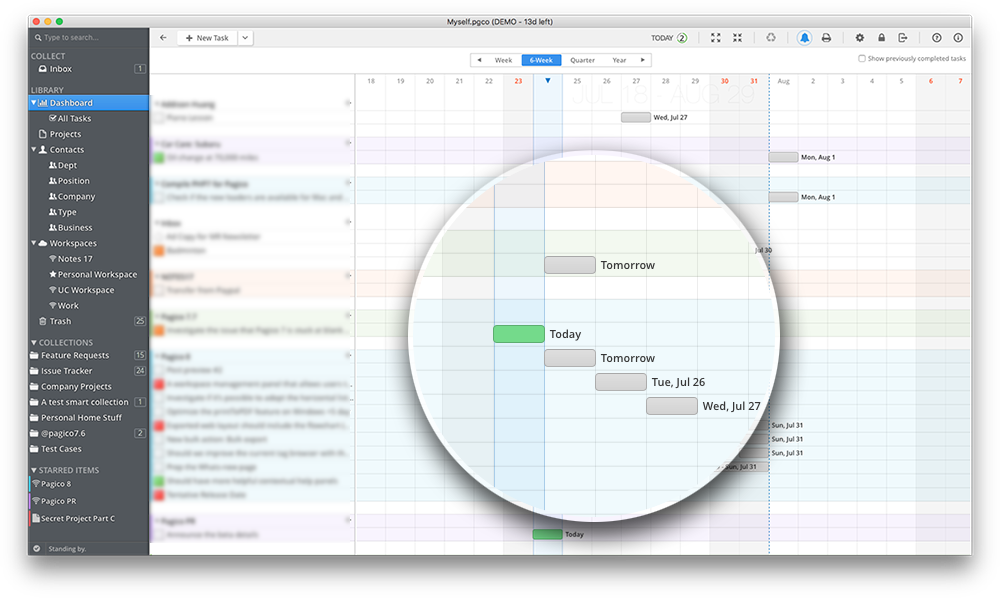
Color-coded flowchart
If you color-code your projects or contacts for any reason, then you’ll definitely love this new feature. The new flowchart presents your color choices in an elegant and informative way.
In-Container Quick Navigation
Do you deal with large projects or contacts? Finding the desired item in a large container can become quite time-consuming. So we came up with an idea to resolve this issue. Introducing the brand-new, in-container quick navigation bar:
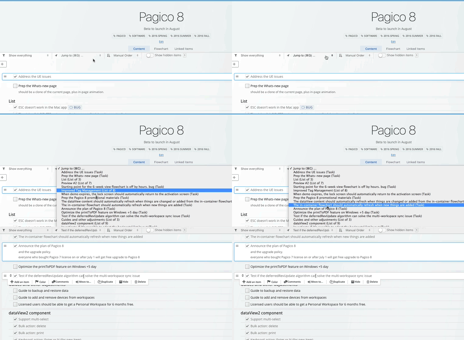
And best of all, this new navigation system is fully keyboard-optimized. Simply press Cmd+G (or Ctrl+G) to pull up the menu, then type the first few letters of the item you’re looking for, then ENTER to make the jump. Isn’t that snappy?
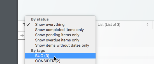
Enhanced in-container filters
The in-project filter has also been updated to let you see things by tags. Want to see just @phone-call or @errands? Just a few clicks (or keypresses!) and you’re good to go!
Brand-new list view
The list view that handles project and contact lists are complete re-written. This time it’s super fast, and it will continue to be fast even when you have thousands of items. Now you can import your 5000 contacts without sweat. And yes, keyboard support is built in. So you can easily select, multi-select, and perform bulk actions such as archive, star/un-star, delete, share in workspace, and more!

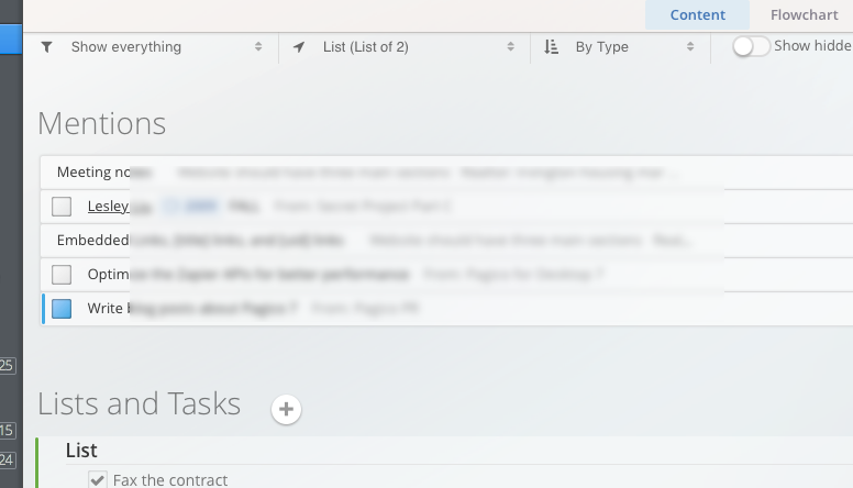
Integrated Mentions section
The “Inbound Links” section is now renamed to “Mentions”, and is now merged into the main data view to better present the data. Not much is really changed here, but with this new arrangement, everything is more straightforward and makes more sense.
Redesigned container UI
This is where you spend most of your time working in Pagico, so we redesigned the UI to make everything more pleasant, less busy and more intuitive. For instance, you now have a “Notes” section for each project that can be used to store project-level status messages, labels, or simply subtitles. The flowchart and Linked Items also got their own dedicated section. That means you won’t see them flying around when you don’t need them, and you’ll also have a fully-featured, interactive flowchart component when you need it.
The title area is much more roomier and more modern in styling. The main actions for containers are now re-arranged to the right-side so they don’t take up as much space, while being easily accessible.
The filter, new navigation and sorting mode controls are now sticky and will remain accessible no matter how much you’ve scrolled down.

Brand-New Link Helper & Move Panel
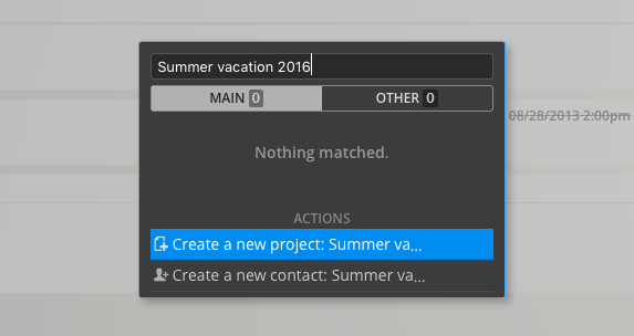
The linking capability is a major component of Pagico, it’s what makes Pagico unique. In Pagico 8, the Link Helper and the Move panel gets a major update. Not only do they look sleeker, they are also fully keyboard operable and they allow container creation on-the-fly. Want to move a task to a new project? Simply use the link helper, type in the desired project title, and hit ENTER to create AND make the link. All in just one fluid action.
Enhanced User Experience
As mentioned before, user experience is a primary focus for Pagico 8. We want to make Pagico as intuitive and as fluid as possible, especially for actions that you perform frequently. For example, you’ll be able to choose whether to create a list, or a task, and list item actions are now organized into popup menus to reduce visual clutter and accident clicks while maintaining accessibility.

Another example of user experience improvement would be the consolidated member list for workspaces. Now Pagico is intelligent enough to identify devices belonging to the same user, so you don’t end up seeing desktops and iPhones in a team workspace. You would instead see things like this:
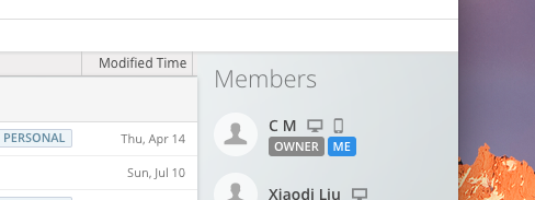
The list is much shorter to look at, and most importantly, delegating tasks becomes much easier. You get to see and work with persons, not devices.
And a lot more!
Pagico 8 packs a lot more exciting new features and improvements. We’ll share more of them with you in future articles.
Public Beta
The public beta of Pagico 8 will start on August 1, 2016. If you are interested in getting early access to Pagico 8, don’t mind dealing with a few glitches and sharing your feedback with us, please sign up for the Public Beta below.
Availability & Pricing
Pagico 8 will be available for macOS, Windows, and Ubuntu. It will be a paid upgrade with a heavy discount for existing users to upgrade. Customers who purchased Pagico 7 licenses on or after July 1st 2016 will get the upgrade for free. Teams who maintain an active subscription of Small Team Workspace or larger at the time of Pagico 8 release will also get the upgrade at no charge. Detailed pricing options and the release date will be announced shortly.
Tremendously faster, elegantly redesigned, more powerful and yet easier to use: Pagico 8 is guaranteed to help you become more productive, and we cannot wait to get it out to you.