Pagico 6 is almost ready! While we’re doing the final touch-up work, we cannot help but to share our great excitement with you guys (see our sneak preview #1, #2, and #3 if you haven’t done so yet). Today, I’d like to share some screenshots with you. This time, is the gorgeous Pagico 6 UI on Retina display. And since Retina displays have huge amounts of pixels, unfortunately, we can only show you corners of the Pagico 6 UI.
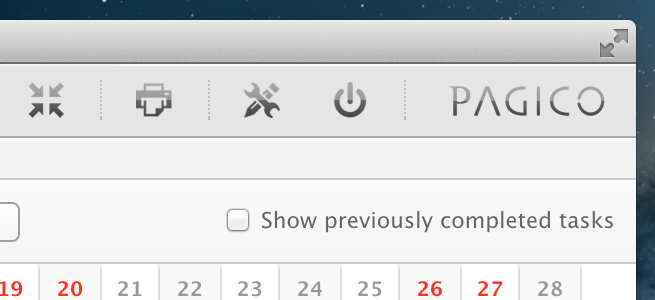
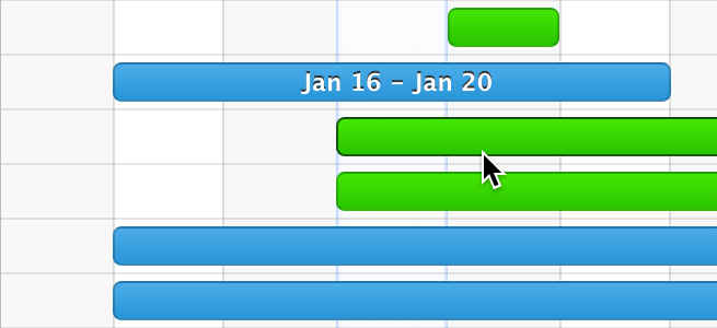
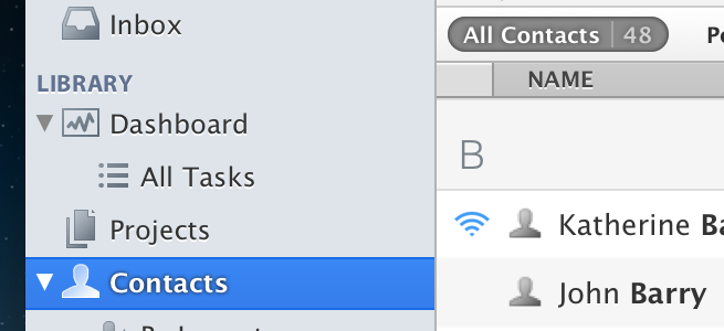
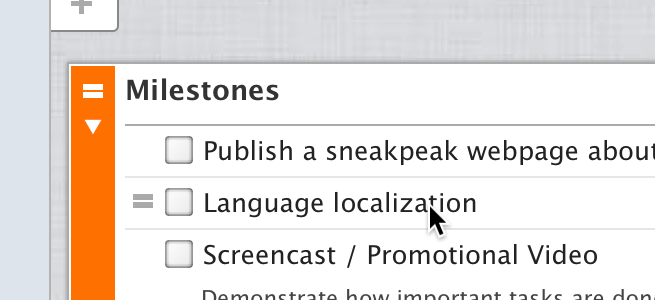
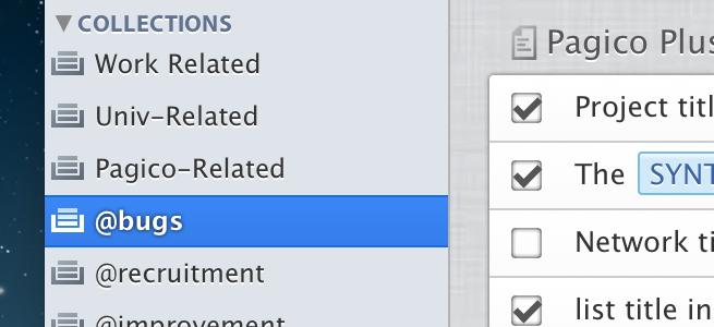
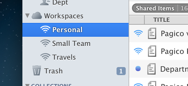
No matter if you have a retina display or not, everything will look sharper and more polished in Pagico 6. We worked very hard on improving the look and feel of the app, literally left no stone unturned. In addition to looking better, the UI also responds much faster to your inputs as well. This all adds up to a hugely improved user experience.
Pagico 6 is coming on February 20th, 2013. Stay tuned!
Ryo