![]() So, it’s great that most of our users are very happy about the new 3.1 release (although the EML feature is still very unstable, we’re working on it!).
So, it’s great that most of our users are very happy about the new 3.1 release (although the EML feature is still very unstable, we’re working on it!).
But regarding to Pagico, there are something else that you probably will like.
Yes, it’s the upcoming Pagico 3.2! A dramatic change is planned to be carried out with the 3.2 release, and hopefully it’s gonna make Pagico better than ever.
Let me show you something.
It is the interface. With the wonderfully designed interface of Pagico right now, we’ve received lots of praises over it: it’s just gorgeous. However, besides these praises, we do have received tons of complaints about it: it’s so much different than a normal Mac (and Windows) application that it takes forever to get used to it.
So, we think it is time to make a change to this interface, a change that can dramatically shorten the time needed to get used to Pagico.
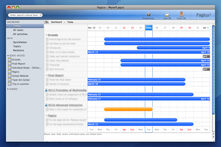
So here it is, let’s take a look at the brand new Pagico 3.2 (still under development and subject to change):
The dashboard view in Pagico 3.2

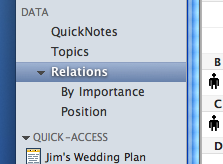
In Pagico 3.2, auto-groups and topic folders will be displayed like the image below:

So, it looked wonderful and we loved it. However, there are still weeks before we can actually deliver this new release, so now everything is subject to change, and your opinion matters!
Please let us know what you think about it, and what do you like / hate so we can make it as close as possible to perfection. 😉
Cheers!