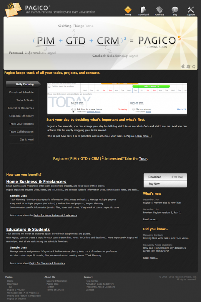
 Happy Thursday, everyone! Today I am excited to introduce you to our brand-new website design for the year of 2012. The previous web design was originally created back in 2007 and has been updated all alone since then.
In the past five years, our products have changed dramatically, and even our product lines have changed, too. From the initial three desktop editions in our early years, now we have a much bigger product family that also has workspaces, Pagico ID as well as Pagico Plus for iPad. Apparently the original web design is no longer sufficient to effectively present all of these new faces. Plus, many of the graphics resources we used in the old website are in dare need of updates as well.
So, in the past few weeks, we’ve been working hard to come up with a brand new web design that can do all of these jobs well. And I believe we’ve done that! The new design is contemporary and minimalistic in style, and much more functional and logical from the content perspective. For those of you who cannot wait or haven’t seen this new design yet, please head over to our home page and enjoy! We certainly hope that you’ll love the new design as much as we do. 😉
Cheers,
Ryo
P.S.: For those of you who are interested, here’s a snapshot of the old design so you can do a quick comparison:
