As you know, we posted a series of articles about P+ (Pagico for iPad) a while ago covering different aspects of the app. But since then, the app has undergone a 2-month beta testing with dozens of users, and we made a number of improvements to it during the testing process. Today, I’d like to share some of the newly introduced cool features with you.
The all-new Agenda View
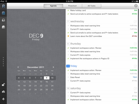
The home screen we initially posted this post was not that attractive. Neither was it very helpful. So, we ditched it and designed a new home screen from ground up. This time, we are calling it the Agenda View.

This Agenda View breaks down all your tasks and presents them in a very sleek week view, so you can get a very clear view of what needs to be done in any given day in the current week. An interesting feature that’s worth mentioning is that it recognizes multi-day events and shows them on all the covered days. This helps you stay on track better with long-term tasks. And if you need to create a task that’s due on a particular day, you an just tap on the “compose” icon next to the day to start writing about the task — the due date has already been filled out by P+. Isn’t it neat?
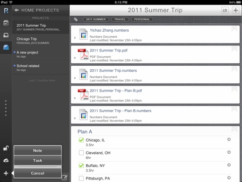
The globally accessible new task/note feature
Previously, you will have to switch to either the Inbox or the home screen before you an create new tasks or notes for Inbox. But with the new P+ app, you can do so at any time using the new globally visible button located at the lower left corner. By using this button, you can easily create new notes or tasks, which can be saved quickly into Inbox, or into any projects or contact profiles that you already have on your iPad.

There’s more to come…
This is it for now, and I’ll for sure bring you more fresh details in the coming days. Again, the P+ app for iPad will be available in the App Store on December 12th.
Cheers,
Ryo