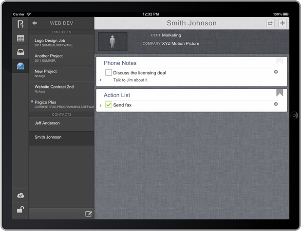
Greetings, everyone! Today I’ve got some great news that everyone has been waiting for… (drum roll)… the mobile Pagico app for iOS! And we are calling it Pagico Plus (or, P+). We know that it has taken too long to bring you this app. But as we promised earlier, we wanted to make sure we spend some quality time and get it right, so that it can be worth the wait. I’m not implying that this initial version is perfect — there are still a large number of things we’d like to do, but we believe it’s off to to a great start.
Introduction
First off, the desktop version of Pagico is a huge app. Nearly five years ago, we started it with a simple idea and now it has become a beast with hundreds of features and tons of details that make it unique from its competition. It’s feature-rich but not bloated, as we completely refactored the project several times as we progressed forward. So, how do we make such a huge program smaller and fit it onto mobile platforms, such as the smartphones and tablet computers? We can certainly go the easier route, by watering down the project to a minimum and just go with it. But by doing so, we’re literally making Pagico into “just another task manager” with clunky user interfaces. Who would like to use that, right? So what we wanted was a tall order: to completely redesign Pagico for mobile platforms, and maintain the unique capabilities that desktop versions have. To achieve this, we started from scratch and threw away five different designs before we were finally satisfied with our last one. This, is why it took us so long. And this, is what we’ve done to make you guys happy.
After weeks of debate, we concluded that the iPad app was our top priority when comes to developing for mobile platforms. This is because we believed that the iPad (along with other tablets) is the best platform for us to deliver great user experience and functionality. Besides its superior performance and other capabilities, the form factor (large screen) is a No. 1 key factor when comes to presenting complex data, productivity, and user experience. So we decided to specifically design for the iPad from ground up, and then we can port it to other tablets, and then water it down to fit it into smartphones, such as the iPhones and Android phones, etc.
Now, onto the app itself, shall we? 😉
Introducing Pagico Plus (P+) for iPad
In short, P+ is a mobile add-on for your desktop Pagico programs. It works as a mobile workspace client that allows you to work and stay synchronized with your teammates. In addition to your workspace data, you can also access your inbox data as well. This makes it easier to capture notes and ideas into Inbox when you’re on the go, and process everything when you’re settled down in front of your computer.
As a sneak preview, I’ll be brief on the features for now, and post more details down the road. Screenshots provided below can be enlarged with just a click. Now let’s get started!
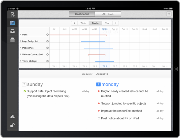
Once you are logged in, you’ll be able to see the main screen of P+, which is consisted of three primary sections: Inbox, Workspaces, and of course one of our signature features: the Dashboard view that features the famous schedule flowchart. Again, you can click to see the full-size screenshots.
The Dashboard View
You probably already noticed that P+ doesn’t seem to feature the Must-Do and Might-Do lists. Replacing it is the newly designed Agenda view that gives you an overview of all your schedules in the current week. And you can tap on each individual items to see more details, or switch to the parent project/profile and get more info.
Workspaces
P+ is just like its desktop version when comes to accessing workspace data. You can easily join existing workspaces using invitation codes just like you would on the desktop. You can join as many workspaces as you need, and navigating among them is just as easy.
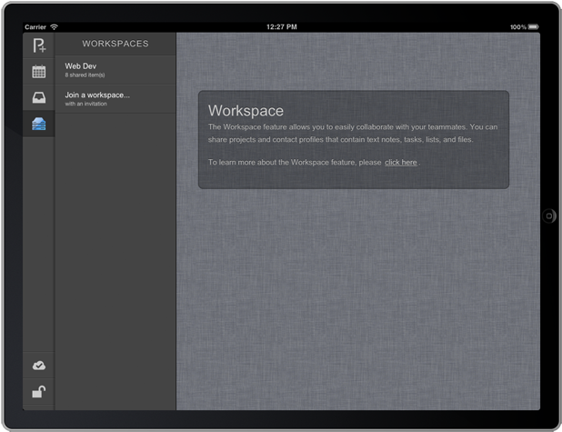
To access a particular workspace, simply tap on its item and its content (projects and/or profiles) will slide into view as a list.
The Data View
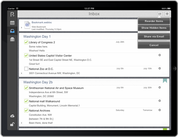
Inline with the desktop versions, P+ uses a single module to handle the display of all your data objects. Optimized for mobile platforms, the data view on P+ features a few unique things, including a hidden-item-only view, and an option to pack everything and share your data via email.
Wrapping up…
There are so many more things about P+ that I’d love to talk about, but considering this post being a sneak preview, I’ll keep it short here. More details will for sure be posted as we go. As of now, P+ has been privately tested for about a week now, so everything you’ve seen here are already functional, and actually quite stable (which is good, by the way 😉 ). Now you must be wondering when you can have it. And the answer is: this fall, which is when iOS 5 releases. P+ is designed and developed for iOS 5 because of a number of reasons, so we’re planning to get it out right after iOS 5 is out. P+ for Android-based tablets will follow right after the iOS version.
Last but not least, here’s the beautiful icon of the app for your enjoyment while you wait. 😉 As always, please feel free to send me questions and comments, and I’ll be happy to answer them in our future posts regarding this latest addition to the Pagico family.
![]()
Cheers,
Ryo
