Pagico on iPad??!
First off, I am just one of the crowd who just can’t be more excited about iPad. As a team that develops applications for Mac, we can’t help but start envisioning about how Pagico on iPad will mean to our users, and the result was extremely exciting: iPad is the perfect mobile platform for Pagico!
I know that some of you might come out and shout “Hey you guys haven’t delivered the iPhone version which was promised 2 years ago!”. I know. But there were a few reasons that prevented us moving towards that route. One of the biggest problem is usability — Pagico is not just another task planner. It’s much more than that. So trying to do so much on such a small device is a very daunting and risky task. Watering it down for just Inbox access it not an ideal solution, either. This time, iPad provides us a much larger display to handle complicated structure with enough room for navigation system to work, and a much faster processor to handle sophisticated activities.
So, we’re now with the drawing board, laying out plans for Pagico on iPad. Early experiments have already been started, and we’re very confident to start developing applications for the iPhone OS. Now, here’s a question for you: What do you want to see and use in Pagico on iPad? Please let us know! Right now, everything’s possible and we do appreciate any input and comment on this.
A new Pagico v4.2 release
Put this aside, there’s also an upcoming release for Pagico v4.2, too. This release (currently, the r1002) addresses a few minor issues, and is aimed at improving user experience especially for new users.
Enhanced localization support
Starting from this release, we enhanced the multi-language support module, so that if some of the phrases are not translated (which is quite normal when new features are added, etc), Pagico will automatically display the same phrase in English. This ensures user experience with incomplete language packs.
Optimized Might-Do list algorithm
The Might-Do list is getting smarter. It will not clutter the UI by listing too many Might-Do tasks, but it’ll still display those tasks that are due in the very near future. Also, users are able to hide certain Someday tasks from appearing in the Might-Do list.
Enhanced Hands-on user experience
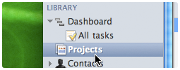
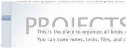
We’ve done a lot of work to optimize the learning curve for new users. One of them is renaming Topics to Projects. In addition, many placeholder messages (the messages that appear when no content is present) are optimized, too.
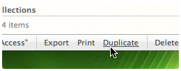
Items can be deleted from list view
This is actually one of the feature that existed before, but was disabled temporarily when the new list view module was used in Pagico v4.2. Now you can delete topics (now called projects) easily right from the list.
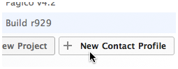
Profiles can be created from collections
In the past, you can see a button for creating new topics from static collections. Now you can create new profiles from static collections, too.
These are only a few improvements in the upcoming r1002 release. More details, including the bug-fix list will be disclosed when the release is officially available. Here are a few screenshots for the UI changes made in this new release.
Hope you’ll enjoy! 🙂


